
Color Blindness
Dyschromatopsia
Normal color vision is the ability of the human eye to perceive colors, based on three types of cone photoreceptors in the retina—short (S, peak in the blue), medium (M, peak in the green), and long (L, peak in the red) wavelengths. Trichromaticity refers to the principle that all perceivable colors can be formed by combining the responses of these three cones, which underlies normal color vision.
Dyschromatopsia is a medical and ophthalmological term for any deficiency in color perception. It is not a disease; rather, it represents a different way of experiencing and interpreting colors. and more than 400 million people worldwide have an altered or limited ability to perceive colors. Color blindness refers specifically to the absence of one of the three types of cone photoreceptors, whereas color vision deficiency (CVD) is a broader term encompassing any deviation from normal color perception caused by altered spectral sensitivity of one or more cones.
The main types of dyschromatopsia: protanopia, deuteranopia, and tritanopia, result from alterations of the L, M, and S cones, respectively. The most common forms are red–green deficiencies (protanopia and deuteranopia), followed by blue–yellow (tritanopia) deficiencies, while total color blindness, or achromatopsia, is rare.
Most cases are inherited and linked to the X chromosome, which explains why color blindness occurs more frequently in men than in women. However, color vision deficiencies can also result from diseases of the eye, aging, or exposure to certain chemicals.
Although color blindness does not lead to vision loss, it can influence daily activities—such as reading color-coded information, interpreting graphs, or identifying traffic lights. For this reason, education and design increasingly consider color accessibility, using patterns, contrast, and labeling to make visual information more inclusive.
Beyond its biological basis, color blindness reminds us that perception is not absolute: even something as universal as “color” depends on individual sensory experience and interpretation
Digital simulator
Color blindness simulation apps are important digital tools designed to show how people with different types of color vision deficiencies perceive colors. They are widely used for educational, design, and accessibility purposes, helping users understand and create visuals that are more inclusive.
These apps apply color filters to images or real-time camera feeds, altering the colors according to the main types of color blindness. The result is a realistic simulation of how colors appear to individuals with these visual conditions. Many apps are available; you can download one via the link.
Dischromatopsic art
Dischromatic art refers to artworks created using a limited color palette. This style emphasizes contrast, composition, and form rather than the full spectrum of colors, producing striking visual effects through simplicity, harmony, or tension between the selected hues.
Ginestra azzurra (blue broom)
Fabrizio Tiribilli has donated his artwork Blue Broom to Enlighting Mind to support our efforts in raising awareness of color blindness among students in Optics, Optometry, and Physics, as well as among visitors to our exhibitions. In this painting, color is perceived in the same way by both deuteran or protan color-deficient viewers and those with normal vision, effectively eliminating differences between visual experiences.
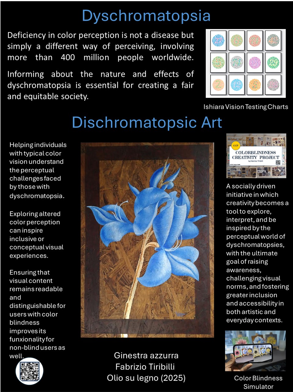
The irregularities of the wood reveal the color in some areas of the painting, but the eye does not perceive them in the overall view; they are noticeable only when one focuses on the details. The texture of the wood and the contours engraved with a pyrography tool introduce material and tactile elements in the work and also recall graphic signs and patterns, which are extremely useful for a visual design that incorporates the perception of color-deficient viewers. It is important to underline that people with color vision deficiencies have a sharper perception of details and subtle shades compared to those with normal vision.
A small perceptual trick is created through the use of chiaroscuro, which gives three-dimensionality to the flower, an effect enhanced by introducing a darker faux brown frame. The broom’s stem seems to pass behind, while the flowers appear to emerge in front. An effect of three depth levels is created: the flower seems to come forward, the brown frame is slightly behind, and the background is still further back.
The stem, with its gold leaf, introduces the theme of mutability, both temporal and spatial. The luminous effect of the gold varies greatly, both with changes in daylight during the day and with shifts in the observer’s perspective.
In Blue Broom, various elements integrate and enhance each other in a complementary way. In the use of oil painting, there is a reference to the ancient works of Giovanna Garzoni and Jacopo Ligozzi, in which art also serves as a vehicle for scientific information.
Colorblindness Creativity Project
Fabrizio Tiribilli created the Colorblindness Creativity Project to raise awareness and explore creativity for people with color blindness. This social and educational project has included workshops at institutions like the Fashion Institute of Technology (FIT), a self-published book, and lectures. Tiribilli's work highlights the creative, social, and design challenges faced by those with color vision deficiencies.
For information on the Color Blindness Creativity Project, visit the link
Ultimo aggiornamento
17.10.2025